

HomeBase
by Martini Capital
Redesigned Martini Capital’s Homebase platform — a credit repair and client management dashboard — improving navigation, trust, and overall user experience.
Design Process
Visit Website
Role
UX Designer
Timeline
June - July 2025
Team
1 UX Designer, 1 Software Developer, 1 Project Manager
Tools/Skills
Figma, Prototyping, Stakeholder Collaboration
SUMMARY
Homebase is a financial management platform designed for clients of Martini Capital, with a focus on simplifying the credit repair process and building trust through clear navigation and modern design. I worked on Homebase during my time at Levanta Labs, where our team was tasked with redesigning the platform’s experience to make it more intuitive and impactful for users. This project gave me the opportunity to contribute to a B2B SaaS solution that helps people take control of their credit journey.
PROTOTYPE OVERVIEW
Introducing a new way to manage and repair credit
STAKEHOLDER COLLABORATION
How did I add value?
As the first UX design intern and sole designer on the Levanta Labs team, I brought a design-first perspective to Homebase. Until then, the platform had been shaped mainly by developers, so I was able to tackle the challenge head-on by applying design principles to improve usability.
Collaborating across
organizations
✱ Martini Capital Team
Provided business requirements, client insights, and feedback to ensure the platform reflected real user pain points
✧ Product Manager
Guided the project vision and ensured alignment between Levanta Labs and Martini Capital.
❃ Engineering
I partnered with the engineering to ensure translating wireframes and prototypes into functional features.
✱ Designer
I led the design side, bringing a UX perspective to balance business requirements with technical execution.
What needs to change?
Homebase is designed with the diverse needs of Martini Capital’s clients in mind. Our goal is to support individuals at different stages of their financial journey by offering tools that simplify credit repair, build trust, and provide a clear path forward.
Login Experience
Outdated visuals and unclear flow didn’t build trust. Users needed a secure, modern, and welcoming first touchpoint.

Financial Tools
Cluttered layout and hidden calculators made tools hard to use. Users needed clearer navigation and real-time feedback.

Dashboard Overview
Scores were shown without context or guidance. Users needed actionable insights, not just numbers.

Community Section
Static and hard to engage with. Users needed a supportive, interactive space to connect and share progress.
UNDERSTANDING OUR USERS
Going Directly to the Source
To design effectively, it was important to understand what users truly needed. Through close collaboration with the Martini Capital team, we defined the main user personas and their key needs, ensuring Homebase was shaped around real client experiences.

The Rebuilder
Clients recovering from past financial challenges who need guidance, transparency, and accessible tools to repair their credit step by step.

The Planner
Proactive users who want to track their progress, manage disputes, and build long-term financial stability through structured planning.

The First-Timer
Young adults or newcomers to credit who need education, reassurance, and simple navigation to build confidence and establish healthy financial habits.
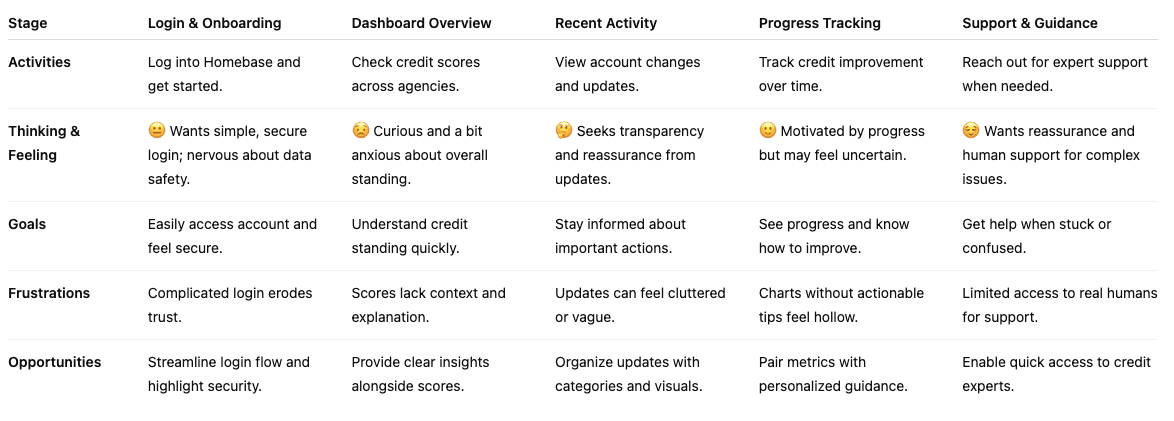
USER JOURNEY MAPPING
Going Directly to the Source
By collaborating closely with Martini Capital, I mapped out user journeys based on real client needs and behaviours. This process helped identify pain points, goals, and opportunities, ensuring the platform’s flow was grounded in usability and aligned with stakeholder requirements.
INFORMATION ARCHITECTURE
Turning Requirements Into Flow
I took their requirements for the landing page and user flow and translated them into a clear, structured information architecture that balanced business goals with intuitive user pathways.
It was important to nail down the flow and usability first before moving into the aesthetics of the visual design.

VISUAL DESIGN
Building a Consistent Identity
Using Martini Capital’s existing brand identity as a foundation, I created a UI kit to ensure consistency across the platform. This provided clear guidelines for typography, colours, and components, making the interface cohesive while still leaving room for iteration and refinement.
Typography
Satoshi Variable
Typeface
Weight
Size
H1. Titles
H2. Headlines
H3. Subtitles and Textual Buttons
H5: Body 2
H4: Body 1
15
10
13
22
20
Black
Bold
Medium
Light
Regular
Colours
Primary
Secondary
Gradients
#4DFFA7
#EB7B75
#60A5FA
#FBE17A
#000000
#4DFFA7
94A3B8
#000000
#
#FFFFFF
Icons
Components
Button Style
Sizes
Assets
Reusable Library
Solid
Hover
Small Button
Medium Button
Large Button
32px
40px
45px
Button
Button
Button
Button
Button
Button
Most recent
John Doe
Welcome back
JD
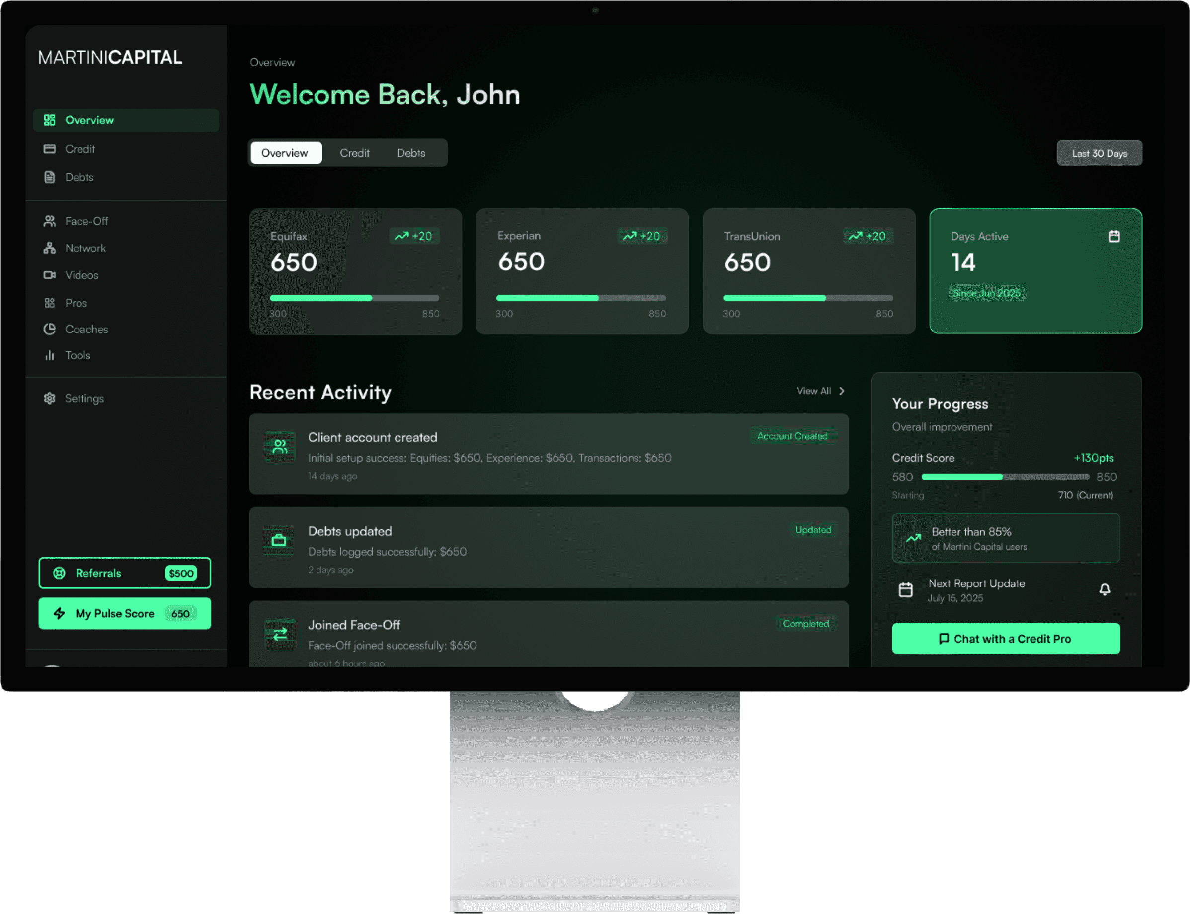
Overview
Credit
Debts
Equifax
650
300
850
+20
IDEATION
Iterating in Figma!
I built the designs in Figma using a shared collaborative workspace, making it easy for non-design teammates to engage with the process. Since many stakeholders didn’t know exactly what they wanted until they saw it, iterating visually and gathering feedback in real time was key to aligning on the right direction.

FINAL PROTOTYPE
Bringing it all together!
To protect sensitive details under NDA, I’ve omitted some parts of the platform. I designed both the client-facing and admin experiences, but here I highlight select screens from the final prototype that showcase the overall flow and design system in action.

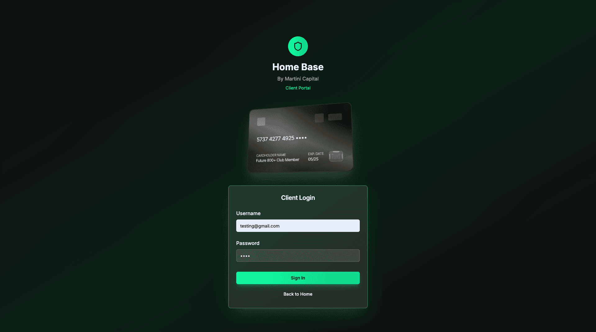
Login Page
Redesigned with a simplified layout and stronger visual hierarchy to improve clarity. Added clear input fields, distinct CTA styling, and trust signals that were missing in the original.
Overview
Streamlined the dashboard with a cleaner card system and prioritized key financial metrics. Improved spacing and typography for quicker scanning compared to the cluttered original.


Debts Tab (Overview)
Introduced clearer categorization and progress indicators for outstanding debts. Enhanced readability and organization, reducing the cognitive load from the text-heavy original.
Credit Score Cost Calculator
Designed an intuitive calculator with step-by-step inputs and instant feedback. The original lacked guidance, so I added visual cues and simplified the flow to make it approachable.

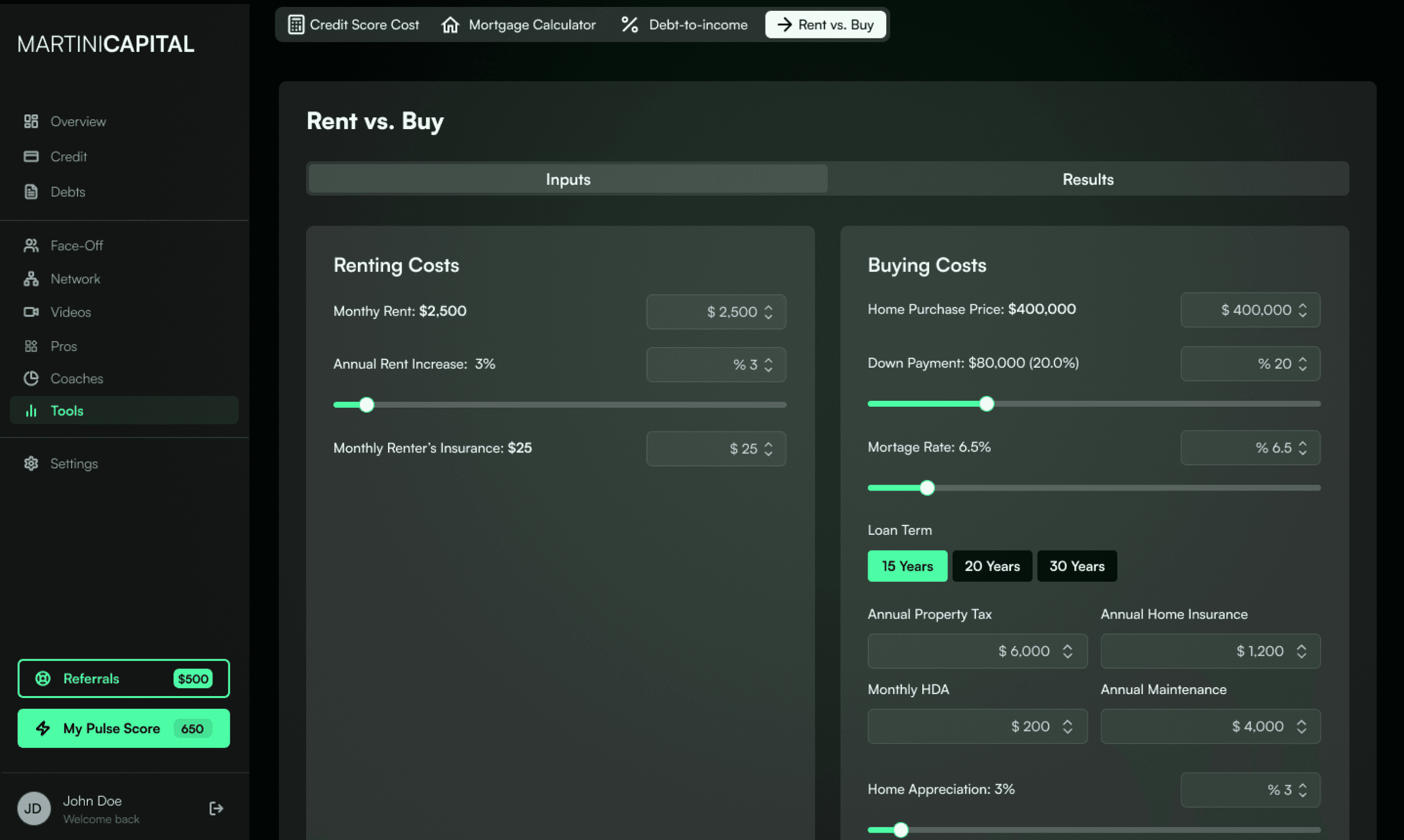
Rent vs. Buy Cost Calculator
Built a side-by-side comparison layout that makes trade-offs visually obvious. The original forced manual comparisons; I introduced visual charts and a clean toggle system.
Face-Off Tab
Created an interactive comparison feature where users can directly evaluate different financial scenarios. The original design was static and numbers-heavy; my version uses visual contrast and icons to highlight differences.

TAKEAWAYS
A summary of what I learned!

Collaboration Across Disciplines
Collaborating with stakeholders, a software intern, and my manager—most of whom weren’t designers—taught me the value of clear communication and rapid iteration. By visualizing ideas early in Figma, I made abstract requirements tangible, aligning everyone quickly and learning how to translate design concepts for non-designers.

From 0 → 1
This was my first time taking a product from the ground up to a functional prototype. Starting with only a list of requirements and a rough existing layout, I was responsible for defining the user flow, building the information architecture, and shaping the experience into something cohesive and usable — all as the sole designer on the project.

Balancing Creativity and Requirements
Stakeholders had clear goals for what the platform needed to achieve, but it was up to me to translate those into an interface that felt intuitive and trustworthy. This balance between honouring requirements and exercising creative problem-solving pushed me to think critically about every design decision.

Iteration and Feedback is Key
One of the biggest lessons I learned is that people often don’t know what they want until they see it. Putting ideas in front of stakeholders early, whether rough sketches or polished screens, sparked the conversations that shaped the product. Feedback became the most valuable part of the process, showing me that iteration isn’t just about refining designs, but about uncovering what users and the business really need.
Testimonials :P
Shoutout to the MartiniCapital and Levanta Labs Teams!