Levanta Labs
Built and expanded key pages within Levanta Labs’ internal platform, filling gaps and strengthening overall usability for cross-team operations.
Design Process
Visit Website

Less expensive than hiring in house
50%

Role
UX/UI Designer
Timeline
May - August 2025
Team
1 UX/UI Intern,
2 SWE Interns, Manager
Tools/Skills
Figma, Wireframing, Prototyping
SUMMARY
Levanta Labs is a B2B SaaS agency that partners with startups and enterprises to design and develop internal platforms, client dashboards, and AI-powered tools that streamline operations and decision-making. While there, I strengthened their internal platform by designing and building new pages that had not yet been developed, improving usability, supporting team workflows, and ensuring smoother client delivery.
TEAM COLLABORATION
How did I add value?
As the first UX designer at Levanta Labs—both the first design intern and the first dedicated designer. Before my role, design was handled entirely by developers, but I brought a structured UX approach that improved usability, consistency, and visual cohesion across every platform we delivered.
Collaborating across
organizations
✧ Product Manager
Defined requirements and set priorities to align the internal system with business needs.
❃ Engineering
Developed and iterated on the system’s core functionality, collaborating to ensure technical feasibility.
✱ Designer
Led UX efforts by translating requirements into clear flows and prototypes, bringing usability and consistency to the internal platform.
What needs to change?
During my review of the platform, I found parts of the site were incomplete, with broken links and buttons leading to pages that didn’t exist. This disrupted the flow and hurt the user experience. To build trust and consistency, these gaps need to be filled by developing the missing pages and fixing navigation.
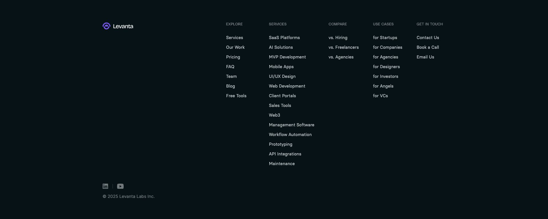
Unfinished Footer Navigation
The website footer highlights multiple sections meant to guide users toward calls-to-action. However, only the Explore and Contact links function — the Services, Compare, and Use Cases pages remain unbuilt, leaving parts of the navigation incomplete.
UNDERSTANDING OUR USERS
Going Directly to the Source
To design an effective platform, it was essential to first understand who would be using it. Identifying user types helps us build empathy, uncover real needs, and create solutions that genuinely support their goals.

Startup Founder
Needs quick access to dashboards and metrics to make informed decisions while juggling limited time and resources.
Operations Manager
Relies on streamlined internal tools to manage client data, track progress, and coordinate with different teams efficiently.

Investor/Advisor
Looks for clear reporting and insights to evaluate startup performance and guide decision-making with confidence.
INFORMATION ARCHITECTURE
Turning Requirements Into Flow
At Levanta Labs, I transformed a list of required pages and tools into a well-structured information architecture, designed to streamline daily operations while remaining intuitive for teams across the organization to use.
Laying out the flow and usability ensured the platform’s foundation made sense before moving into visual design and development.

UNDERSTANDING BRAND IDENTITY
Turning a Loose Brand Identity into a Cohesive Design System
To bring consistency across Levanta Labs’ platforms, I developed a design system built on their existing fonts and visual style. While they had a loose brand identity, there were no clear guidelines in place — so I created one from scratch, ensuring a cohesive look and feel across all new pages and tools.
Typography
Polysans
Typeface
Weight
Size
H1. Titles
H2. Headlines
H3. Subtitles and Textual Buttons
H5: Body 2
H4: Body 1
25
18
20
42
40
Median
Neutral
Neutral
Slim
Slim
Colours
Primary
Secondary
Gradients
#7F5BFA
#E1FF62
#F0F0F0
#012034
#000000
#7F5BFA
#FFFFFF
#8A8A8A
Iconography
Components
Button Style
Sizes
Solid
Hover
Small Button
Medium Button
Large Button
32px
40px
45px
Button
Button
Button
Button
Button
Button
Logo
IDEATION
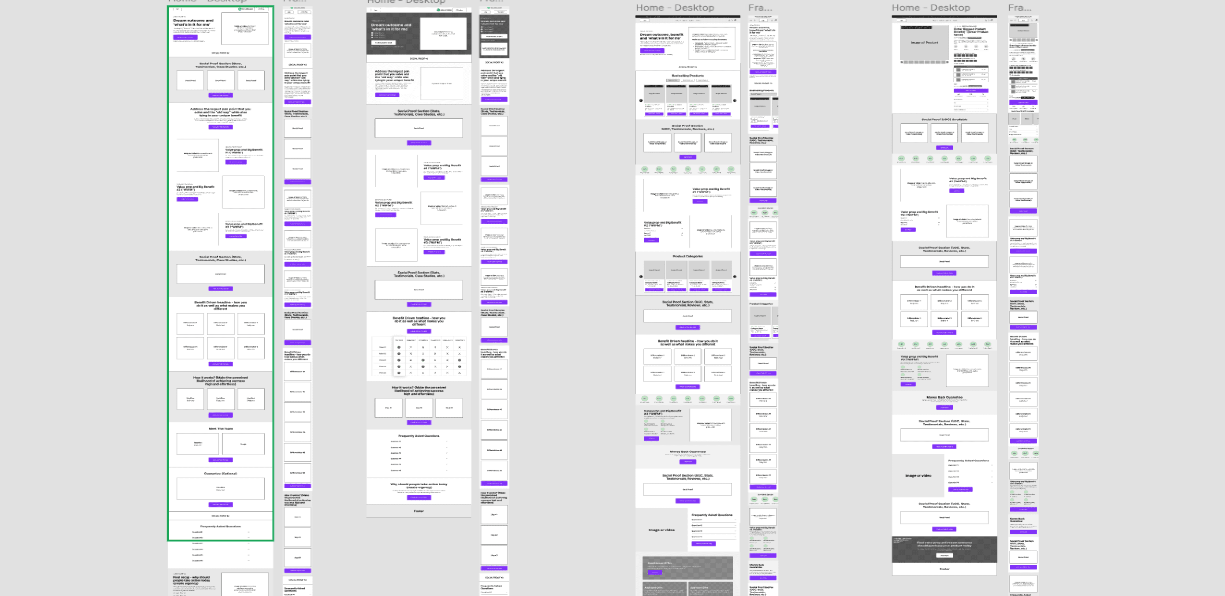
Iterating in Figma!
I began with low-fidelity wireframes in Figma to map out layouts and overall flow. Using a shared collaborative workspace made it easy for non-design teammates to follow along and give feedback. Visualizing ideas early and refining through iteration was key to moving the project in the right direction.
FINAL PROTOTYPE
Bringing it all together!
To respect NDA restrictions, I’ve omitted certain details of the platform. While I worked on both the client-facing and admin experiences, here I’m showcasing highlighted iterations focused on layout and structure. These examples illustrate how the overall flow and design system came together in the final prototype.

Hero Section
Clear headline and CTA to establish the value proposition upfront.
Feature Highlights
Grid layout for easy scanning of key features.
Comparison Tabs
Toggle-style tabs for — introduces interactivity and helps users explore tailored comparisons without overwhelming them, CTA to main pages
Callout Banner
Creates contrast and draws attention to a secondary message.
Portfolio / Case Studies
Structured for quick scanning, reinforcing credibility.
Final CTA
Re-emphasizes the main action at the bottom of the page to capture users who scroll through.
Footer
Organized navigation links — ensures usability and access to supporting pages while keeping the layout clean.
Hero Section
Positioned Levanta Labs directly against hiring, with strong CTAs to set up the comparison right away.
Statistics Section
Used bold, colour-coded stat blocks to make value props scannable at a glance.
Testimonial Banner
Added a strong client quote on a gradient background to build trust and credibility.
Comparison Table
Side-by-side layout that makes Levanta’s advantages over traditional hiring easy to compare.

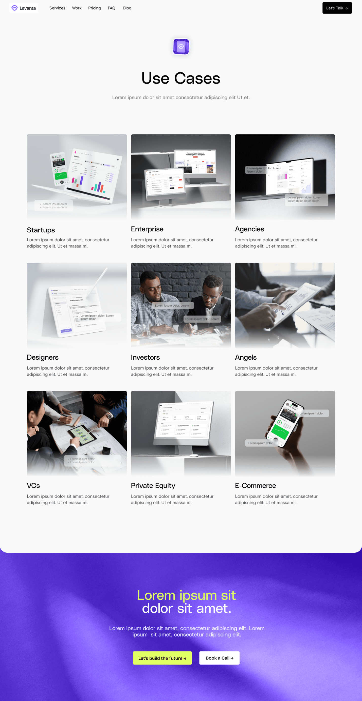
Use Cases Grid
Organized use cases into a clean card-based grid — makes it easy to scan different audiences (startups, investors, agencies, etc.) at a glance.
Visual Context
Each card includes a relevant product or lifestyle image — helps users imagine the platform in their own context.
Final CTA Banner
Bold gradient with dual CTAs — reinforces action after showcasing who the product is for.
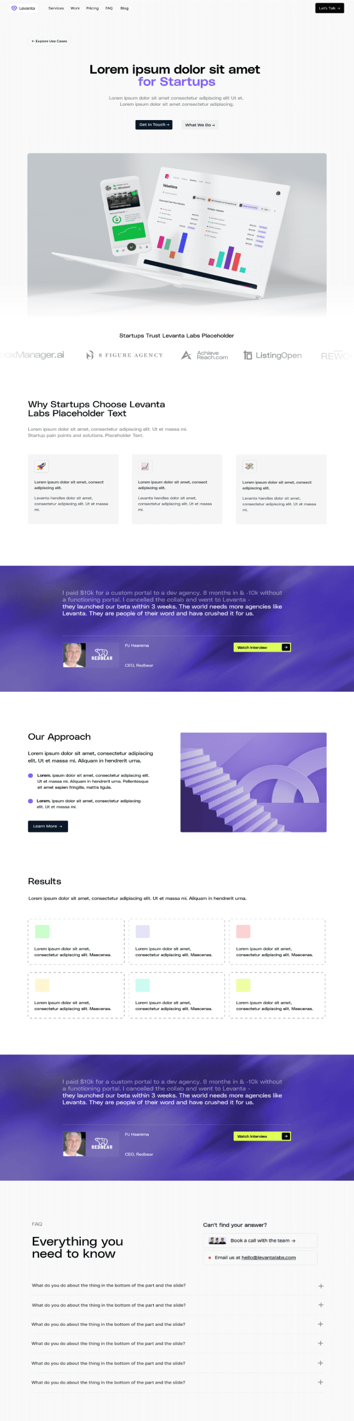
Hero Section
Targeted headline and CTAs — speaks directly to startups and sets context right away.
Product Preview + Logos
Showcases product visuals alongside trusted startup logos — builds immediate credibility.
Testimonial Banner
Client quote on gradient background — reinforces trust with social proof.
Our Approach
and Results
Simple layout, explains methodology in a digestible way. Colour-coded metrics makes outcomes easy to scan and compare.
FAQ
Expandable Q&A at the bottom — addresses objections and reduces friction before conversion.
OTHER COOL STUFF
More from My Time at Levanta
Here’s a sneak peek at some of the other projects I worked on during my time at Levanta. Alongside the main platform, I contributed to internal tools and collaborated on projects for other companies. These explorations gave me the chance to test ideas in different contexts, experiment with layouts, and push the design system in new directions.
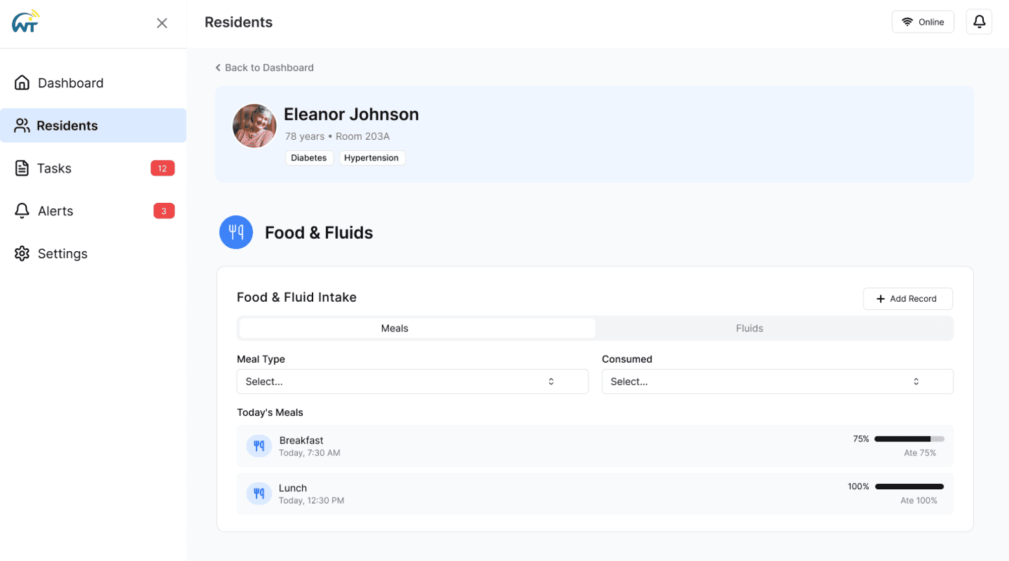
WytCote
Prototyped a platform for senior care facilities to manage patient information, focusing on usability and streamlined workflows.

Integrated Fitness
Prototyped a fitness platform that supports training and client management features.

Internal Cost Calculator
Designed and implemented a cost calculator within Levanta’s internal platform to improve efficiency and accuracy for project estimates.
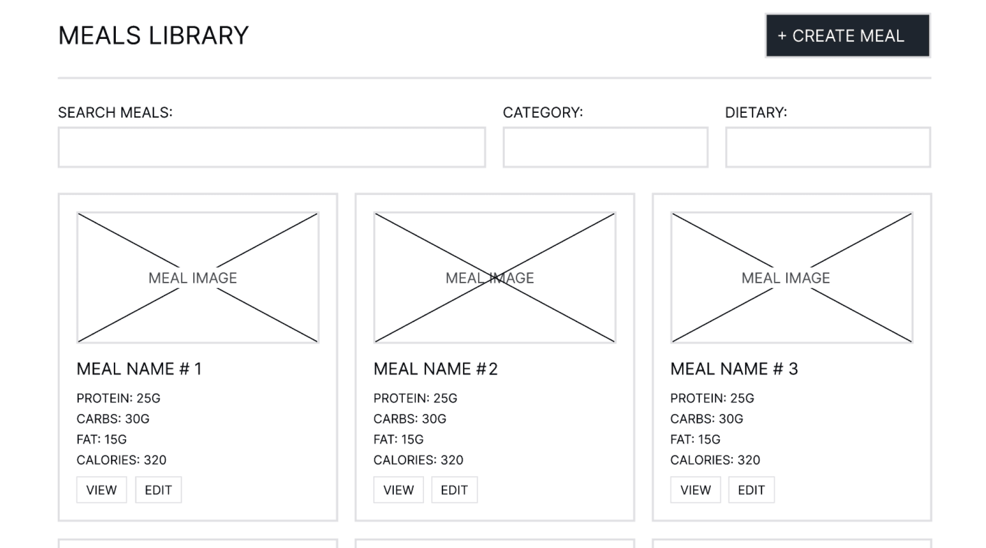
Jet-Lagged Chef
Created wireframes for a meal-prep platform, emphasizing intuitive navigation and clear user flows.
MORE COOL STUFF...
Exploring new brand directions
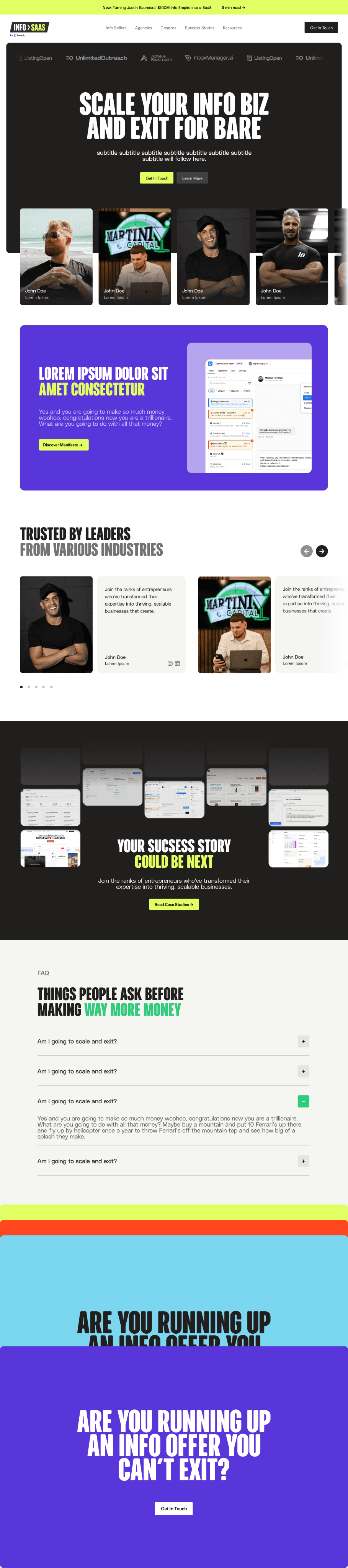
While at Levanta Labs, I also contributed to Info to SaaS, a separate website spun out from the main platform. Unlike Levanta’s core product, this project required exploring a distinct brand identity — one that set it apart while still keeping ties to the overall ecosystem.
Creative Freedom & Iteration
What made this project exciting was the creative freedom to push boundaries. By iterating quickly, I was able to explore multiple directions and refine them based on team feedback.
Exploring a New Brand Identity
Since Info to SaaS didn’t have an established visual system, I experimented with new color palettes, typography pairings, and interaction patterns. This was an opportunity to break away from Levanta’s existing style and try bold new directions.
Prototyping Design Concepts
My role was centered on prototyping layouts and testing design directions. I created multiple wireframes and mid-fidelity explorations to visualize how the site could function and feel for different audiences.

TAKEAWAYS
A summary of what I learned!

Designing Without a Rulebook
When I joined Levanta Labs, there wasn’t a clear design system — just some fonts and a general sense of style. I had to figure out how to turn those loose pieces into something consistent that could actually be used across different pages. It pushed me to think less about perfection and more about creating something practical that the whole team could rely on.
Bridging the Gap
Most of the people I worked with weren’t designers, so just “talking design” wasn’t going to work. I learned to use quick prototypes in Figma to make abstract ideas concrete. Once people could see something on screen, it became a lot easier to have meaningful conversations and make decisions together.

Balancing Creativity with Constraints
I had the freedom to test creative ideas, but I also had to keep business needs and day-to-day operations in mind. Finding that balance was tricky at first, but it taught me that design isn’t just about making something look good — it’s about making sure it actually works for the people using it.